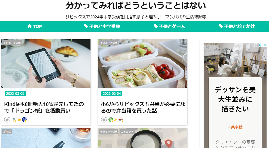
はてなブログトップページの2列カード型表示を、記事の冒頭文章が出ないように修正した内容になります。(ちなみにテーマはブルックリンを使用してます)
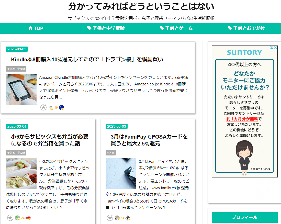
before
はてなブログのTOPページデザインをカード型にしたいと思い、以前までは以下サイトのコードを参考にコピペさせてもらっていました。最初の記事が大きくなるのが特徴です。
コードは以下で、はる場所は 「デザイン」→「カスタマイズ」→「デザインCSS」。
/* トップページカード型 */
@media (min-width: 768px){
.page-index .archive-entries {
display: -webkit-flex;
display: flex;
-webkit-flex-wrap: wrap;
flex-wrap: wrap;
-webkit-justify-content: space-between;
justify-content: space-between;
}.page-index .archive-entry {
margin-bottom: 20px!important;
padding-bottom: 20px;
box-sizing: border-box;
width: calc(50% - 20px);
}.page-index .entry-thumb {
float:none;
display: block;
width: 100%;
height: 200px;
background-position: center center;
background-size: cover;
border-radius: 8px;
}
.entry-thumb-link:hover {
opacity:0.7;
}
}
以前の見え方はこんな感じ。
After
んで、記事の最初にURLを入れることが多く、それがだらだら見えるのを辞めたかったので、別のURLを参考にさせていただき、文章が見えない形に変更しました。コードも各行にコメントがついているので大変分かりやすく感謝です。
コードは以下。なお、参考記事のサムネ左上にあるカテゴリ表示が「桃色バックの黒文字」だったので「灰色バックの白文字に変更してます。(カテゴリラベル色の箇所)
/* カード型表示 */
@media (min-width: 768px){
.page-index .archive-entries {
display: -webkit-flex;
display: flex;
-webkit-flex-wrap: wrap;
flex-wrap: wrap;
-webkit-justify-content: space-between;
justify-content: space-between;
}
/*カード*/
.page-index .archive-entry{
background :#ffffff; /*カードの背景色*/
width: 46%; /*横幅(2カラム)*/
padding-top:210px; /* 上間隔(アイキャッチ画像分空ける) */
padding-left:7px; /* 左間隔 */
padding-right:7px; /* 右間隔 */
padding-bottom:10px; /* 下間隔 */
position: relative;
box-shadow: 1px 1px 4px #cccccc;
transition: .3s;
border-radius: 4px;
}
/* アイキャッチのサムネイル */
.page-index .entry-thumb {
width: 100%; /* アイキャッチサムネイル横幅 */
height: 200px; /* アイキャッチサムネイル縦幅 */
background-position: center center;
}
.entry-thumb-link:hover {
opacity:0.7;
}
/* アイキャッチ */
.page-index .entry-thumb-link{
display: block;
width: 100%;
background-position: center center;
background-size: cover;
position: absolute;
top: 0;
left: 0;
border-radius: 4px 4px 0 0;
}
/* 記事タイトル */
.page-index .entry-title{
padding : 5px 0px 0px 5px; /* タイトル上下に間隔 */
}
/* 記事の概要 */
.page-index .entry-description{
display : none;
}
/* 日付 */
.page-index .date{
padding-top:2px; /*上間隔 */
padding-left:7px; /* 左間隔 */
}
/* カテゴリ */
.page-index .archive-entries .categories {
position :absolute;
top:4px; /* 上間隔 */
left:4px; /* 左間隔 */
z-index:1; /* アイキャッチの上に配置 */
}
/* カテゴリラベル色(記事) */
.categories a {
background: #A9A9A9;
color: #fff;
border-radius: 0.2em;
}
/* カテゴリラベル色(archive) */
.page-archive .categories a {
background: #A9A9A9;
color: #fff;
border-radius: 0.2em;
}
}
/*カード型表示終わり */
見え方はこんな感じ。
おわりに
beforeもafterもどちらも大変参考になる記事でした。cssコード参考書読んで頑張りなさいと言われたら確実にカスタマイズとかやらなかったと思いますが、今はこういう素人でもこういう情報がすぐ手にに入るのが時代なのが良いですね。